Check out my other work
Target Audience
Brand Style Icon
Mobile UI Design
Modura is a new contemporary clothing brand looking to start a brand refresh and have an ecommerse app where consumers can make clothing purchases with ease.
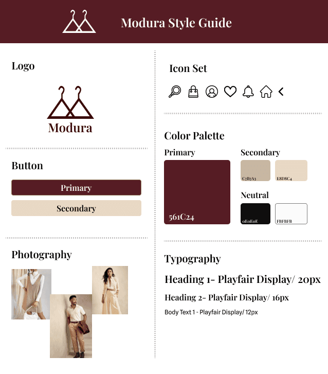
The idea for the logo stemmed from wanting the brand to be connected with clothing and having its identity evolve around it. I created a logo that features two hangers that are placed side- by-side to create a "M" for Modura. After completing this, I went on to create the icon set, which I wanted to keep vsually simple and complent the style of the logo.
For the primary color, I chose a burgundy color for Modura. Burgundy often symbolizes and evokes the feelings of warmth, richness, and sophistication. For the secondary color, I decided to use a beige color to help provide a more grounded feel and appeal to all genders. The burgundy with beige allows for a modernized look to the application.
In terms of Typography, I used Playfair Display because it is often served as the perfect serif font for fashion and editoral.
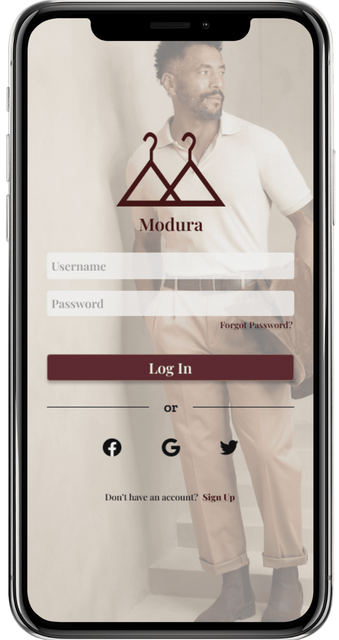
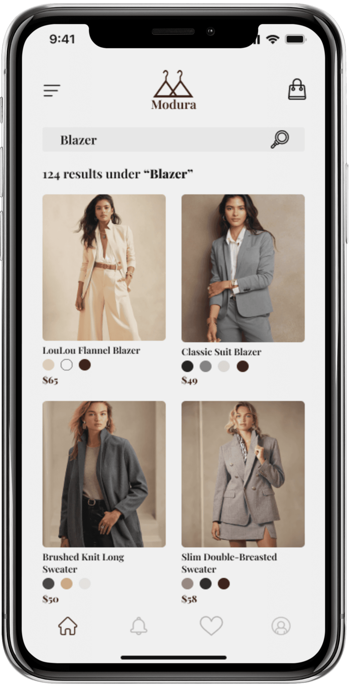
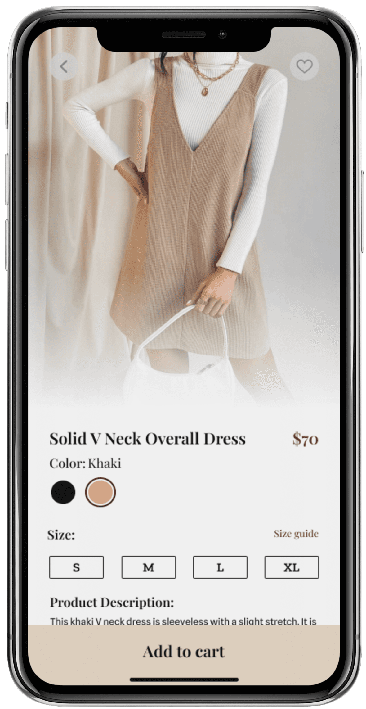
After creating the style tile for the app, I began to work on the creation of 3 sample screens:
- Sign/Sign up scrren
- Home screen
- Details Screen
Modura is for men and women between 18 and 25 years old. These young adults are early into their career and are looking for affordable solutions for business casual clothing to wear at their jobs. They are fashion-forward and want to dress for the jobs they want without appearing overdressed.
