Problem

Role
UX/ UI Designer
Scope & Team
4 weeks
6 Designers
Project
Design System
Tools
Figma, Notion
Project Overview
Goals
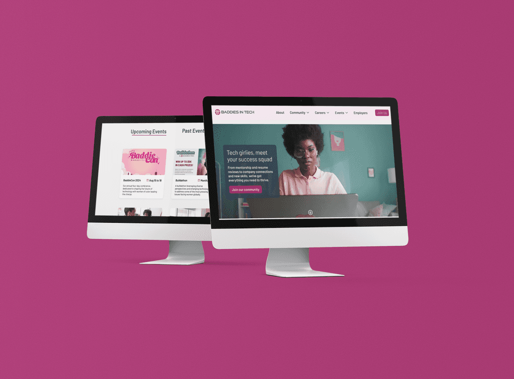
Baddies in Tech is a professional development and networking community for women of color in tech. Their mission is to create a more diverse and equitable tech industry by inspiring, empowering, and connecting Black, Latina, and Native American (BLNA) women in technology. The organization does this through access to career advancement resources and job opportunities, mentorship, and events.
My team ( team website, woo!) created a collection of resuseable components for Baddies in Tech new website redesign. It was important for us to create a concrete design system so we can have cohesiveness and parity throughout the website as well as their platform. In this project, you will see some of the components we have built and gain a bit more knowledge of the essence of Baddies in Tech.
Problem at Hand
How can my team create a design system that is simple, scalable, and understandable by designers and developers?
Problem
Problem
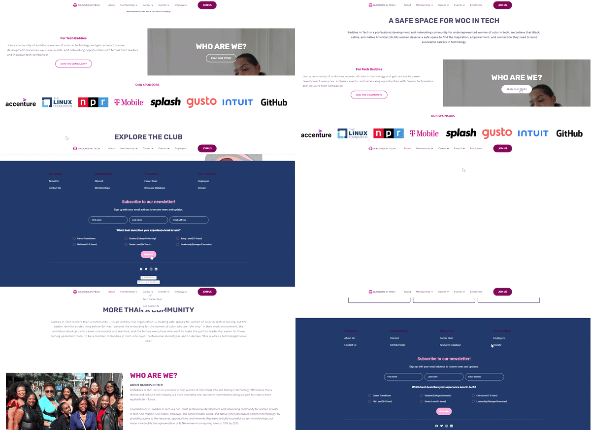
Baddies in Tech's current design system is very lackluster and not cohesive. All of the buttons states were different across the board, the input fields were hard to see against the deep blue they chose for the footer. Due to the scale of the project, we needed to create a system that would be cohesive between both the platform that was being created as well as the website.
In order to execute this redesign successfully, we had to start from scratch in terms of creating a new and defined design system that will be accessible, cohesive, and follow Baddies in Tech's brand.
Problem

Foundation: Grid System
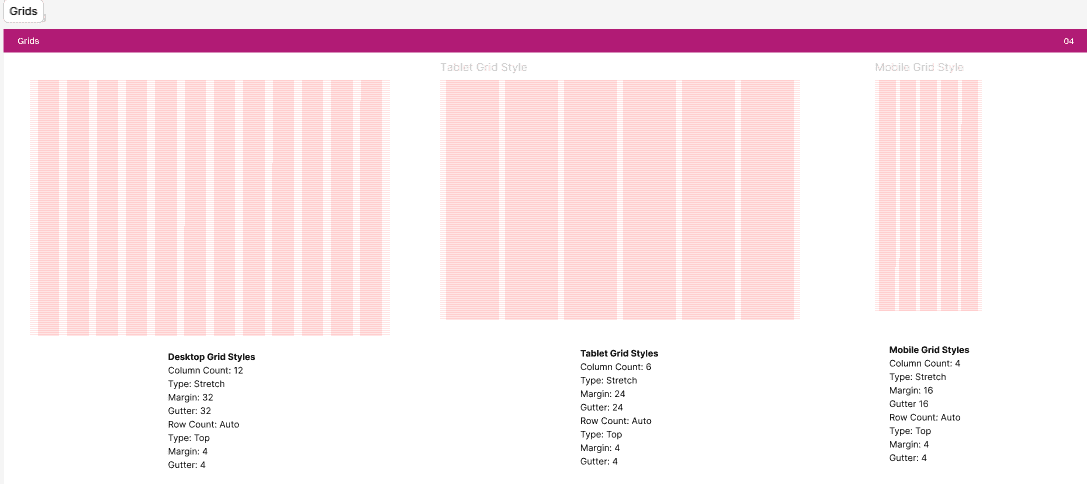
No one ever starts building a house without its foundation, this same analogy can apply to building a design system. We werent familiar at first about how to go about creating this foundation, but thankfully, tools such as youtube and google helped us out trendmously in deciding what we would need to tackle first. We first decided to create a grid system because it served a a guide of how we would be able to construct the entire website. For the grid, we chose a 4pt grid system that consists of a 12 column grid. The reason we chose the 4pt system was to make sure the design could be more responsive through each of the screens we were building.
Problem

Typography
Though it was a website redesign, my team ultimately decided to keep the barlow font from their current website. Having the slightly-rounded, low-contrast typeface was an excellent decision because it communicates simplicity while having a warmth to it, which aligns perfectly with Baddies in Tech's mission in being an inclusive organization and welcoming everyone from different backgrounds. It is also versatile, having several variations in weight which makes it look great as a heading font and as body text.
Problem
Color Palette
As a visual artst, I put weight on how aesthetically pleasing the use of color is on any of my designs, however, I wanted to place accessibilty, clear communication, and brand identity above aesthetics. Color supports the purpose of the content by communicating things like hiearchy of information, interactive states, and the difference between distinct elements. Like many designers, colors should have meaning and be selected intentionally. In Baddies in Tech, we wanted to chose a color pallete that reflects and embodies the organization's values of female empowerment and mission of creating an inclusive space for women who is not afraid to go aginst status quo and brake barriers doing it.
For the primary color seen throughout the sight, we chose a deep pink color that helps convey the idea of feminity, creativity, and royalty. From there, each color fell into place, making sure each color had a role and a specific meaning based on how they function withn the interface.
Problem

Iconography
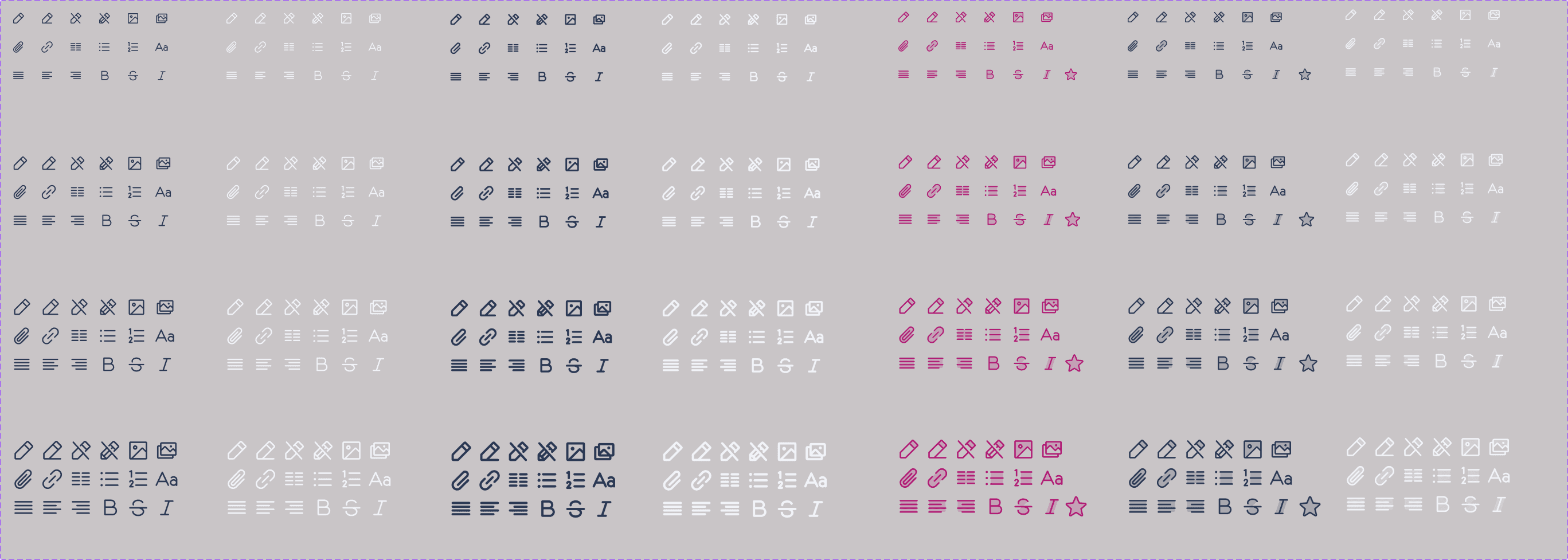
In the Baddies in Tech's design system, we decided with the feather icon library because it's simple, informative, and complements the overall visual language of the design system. Due to how large the scope of the project was, we made different icon sets to provide a wide range of options for both design teams to use for their respective task, as well as creating different weights for each icon to represent different states. We wanted to focus on simplicity to help users understand the concept the icon represents and recognize icons on smaller screens. Below is an example of one of the many icon sets we've created.
Problem
Buttons
Buttons are very important and integral to any design system. Buttons are how the users navigate through each page of the design, but what many fail to realize is the different states that every button has. The most common states are active, hover, focus, and disabled. For the Baddies in Tech website, we created buttons for each of the four states as well as states for the secondary buttons. To keep consistenc in our efforts to make a wide range of options avaiable to both our team as well as the platform's team, we created pill versions of each button. Below are some of the buttons in a few different states.
Problem


Input Fields
Input fields are similar to buttons in the sense that they need to accomodate several different states. Of course one of the most important things I try to keep in mind when desiginging form felds is accessibility. I wanted to ensure that users would be able to know when the input is selected, hovered, or if an error has occured. I also wanted to ensure that the title of the field didnt go away when selected. These were many of the considrations that were taken into account when creating the input fields.
Problem
Other Components
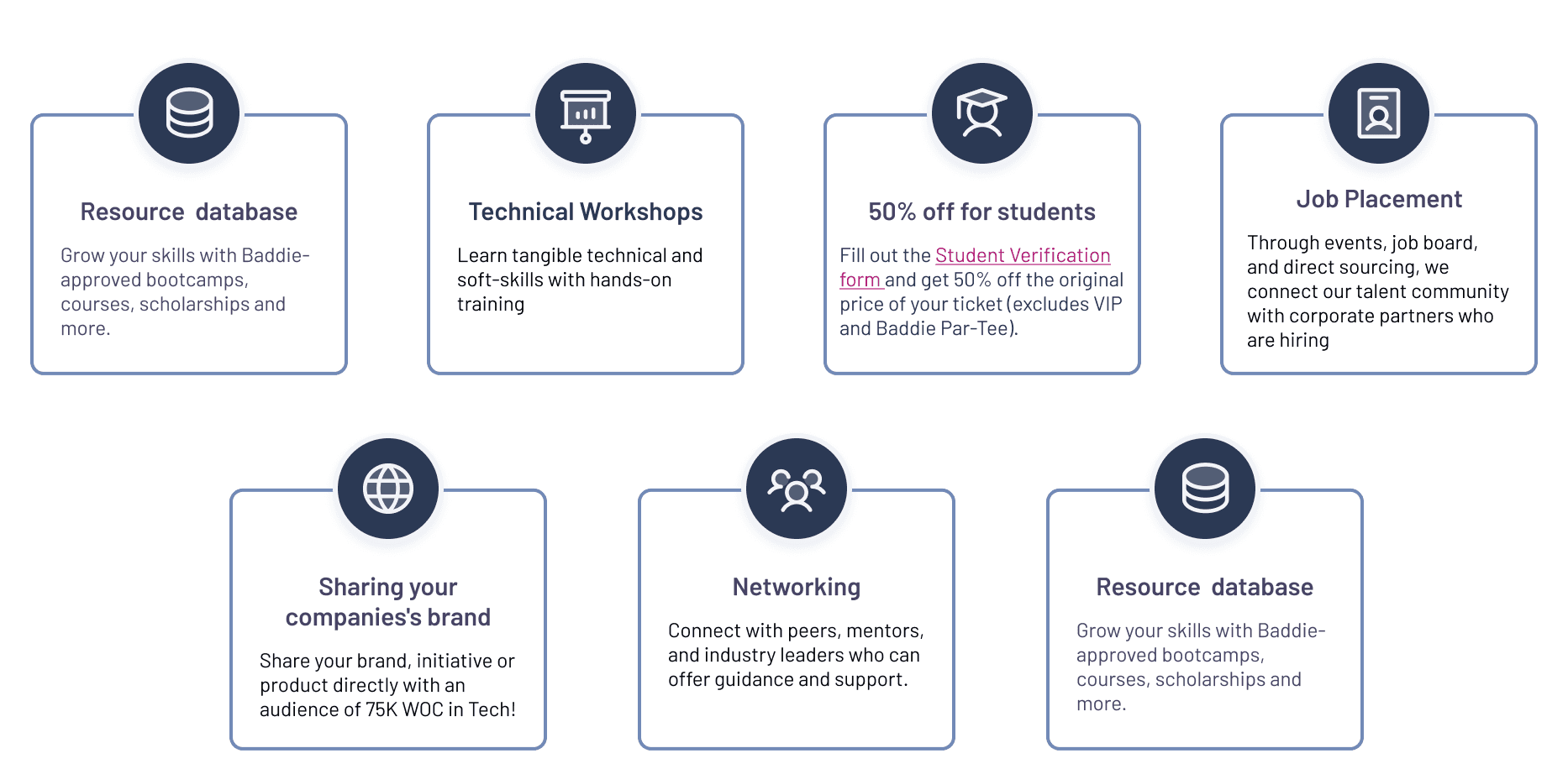
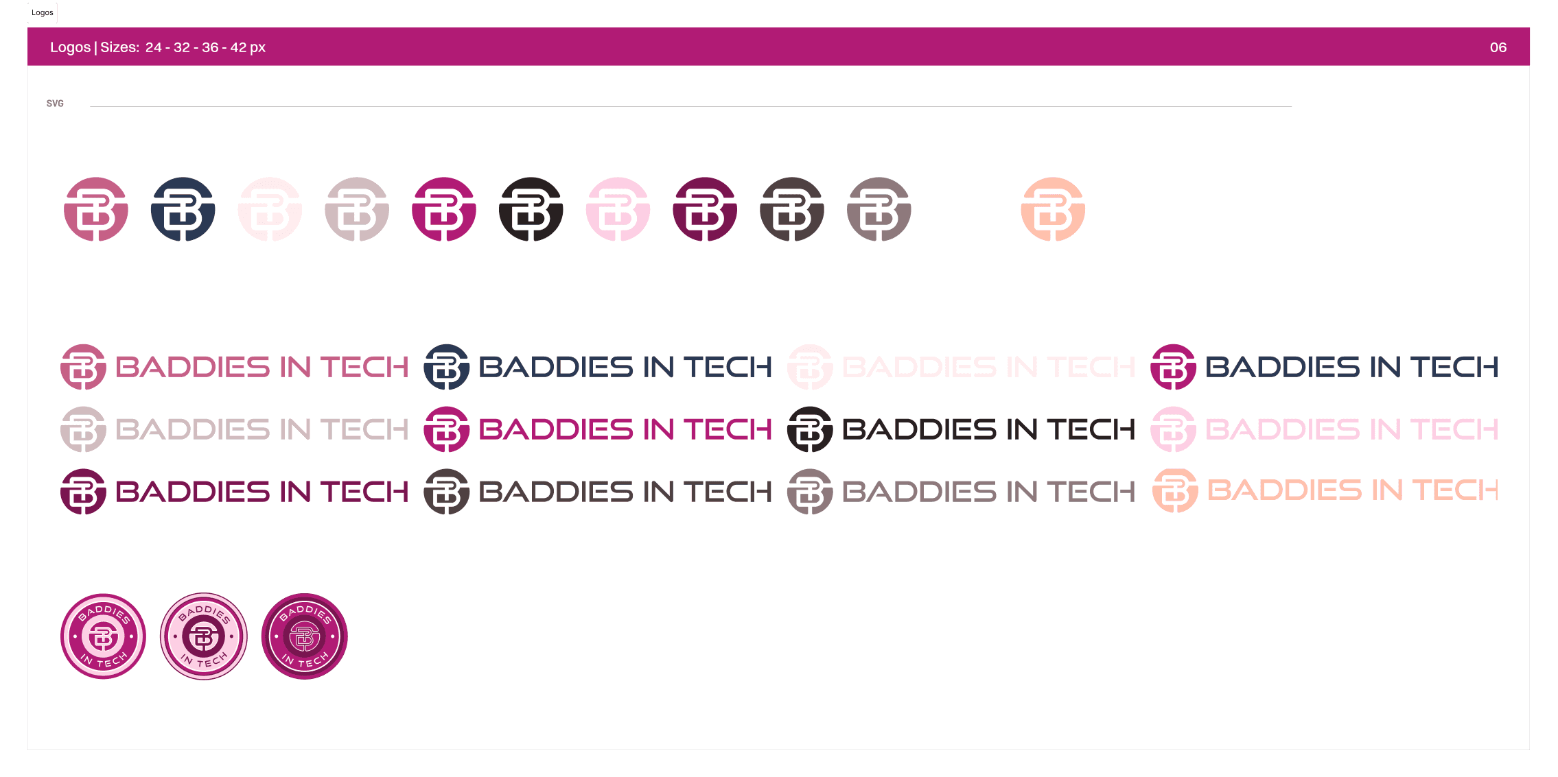
Design systems is a very complex thing, and I have only scartched the surface of all the components that have been built for the Baddies in Tech's website. For other components, we have created different cards that will be seen throughout the website to help with the visualization of the different programs and resources the organization offers. We have also created different versions of the Badies in Tech's logo and brand mark to enhance their branding.
Problem
Results?
The design system does has alot of components, however our UX research team was able to text out some of our design system choices that we have implemented on the website. Our constrast evaluation came up as a 6.4 out of 10, supassing accessibilty quote. The design system has also made it easier for our development team by having them spend less time coding new components onto the site. And most importantly, it has made hand off a lot more efficient as we closed off phase 1 of the Baddies in Tech project and get ready for phase 2.
Problem
Next Steps
As Baddies in Tech moves onto phase 2, I hope to collect feedback from a designer's perspective on how the system has improved their workflow and onboarding as well as how it can be improved for the next team to take on the project. I am hoping to create more design systems much like this and hopefully this can increase and productivity for all those involved.
