Professional Development
Baddies in Tech Redesign
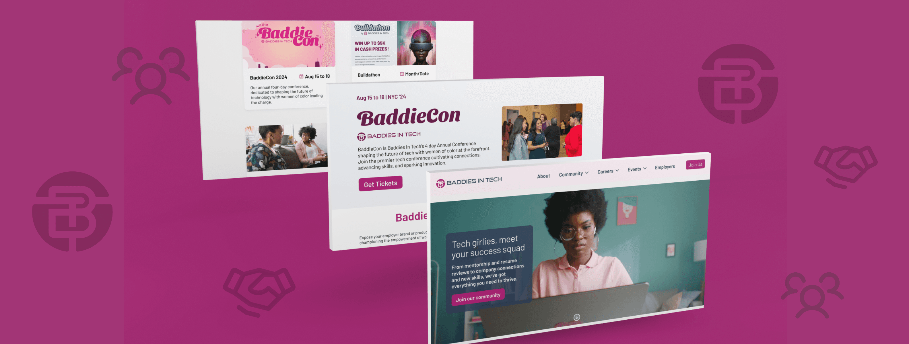
Baddies in Tech, an organization dedicated in creating an inclusive space for women of color in tech, is looking for a redesign for their current website to make it a clean and intuitive user experience for its members, future employers looking to hire its members, and company partners.

Role
UX/ UI Designer
Scope & Team
8 weeks
6 Designers
Project
Website Redesign
Tools
Figma, Figjam, Notion
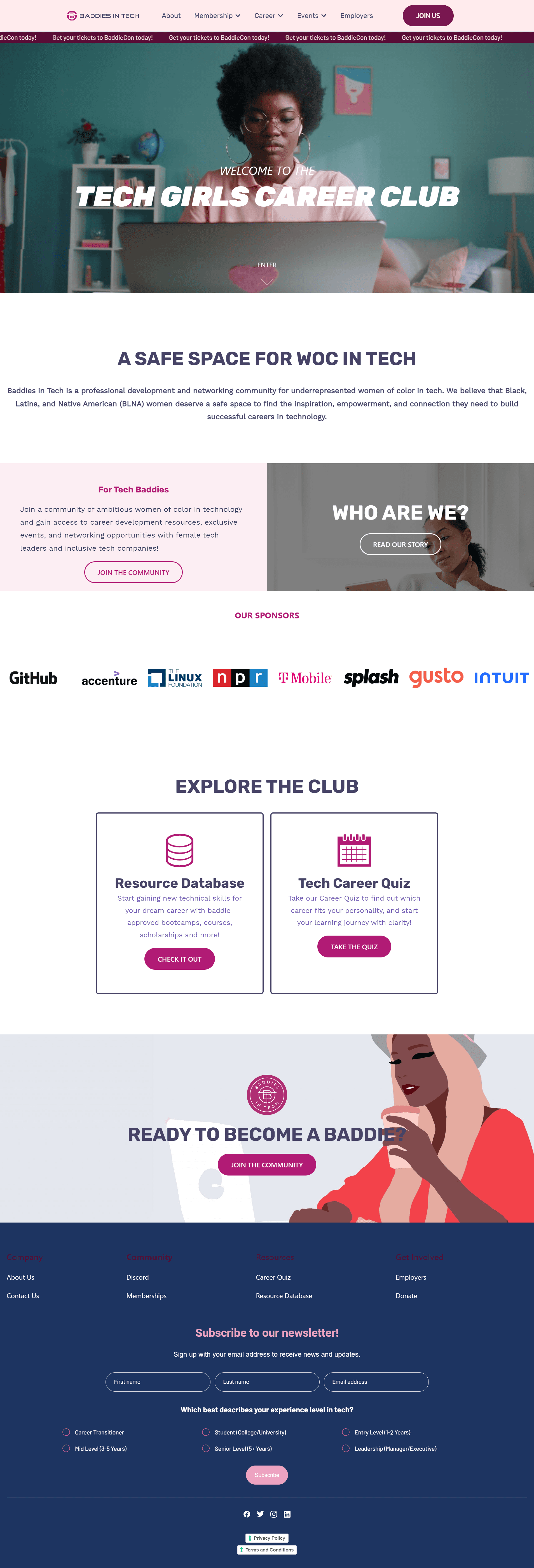
Current Design
I had the pleasure of working on Tech Fleet's largest project to date: a partnership with Baddies in Tech to redesign their website and create a member portal.
Baddies in Tech is a community focused on professional development and networking for women of color in tech, aiming to foster diversity and equity by empowering Black, Latina, and Native American women through resources, mentorship, and events.
As a strong advocate for uplifting marginalized communities, I eagerly applied for this opportunity and was one of six designers selected from over 400 applicants. I was excited to contribute but knew the project's scale required careful research and execution.
Project Overview
Baddies in Tech's website was not effectively converting vistors into engaged memebers or driving direct impact to their initiatives and bottom line. The main challenges that the organization was facing boiled down into three areas:
Problem
Onboarding of New Members: The current website was not effiectevly converting vistors into new memebers, which was stunting the growth of their community.
Partnership/Sponsorship Leads: Baddies in Tech were missing out on potential partnerships and sponsoship opportunities due to the limitations of the website's design and functionality.
Access to Resources & Oppurtunities: Vistors to their website were not able to easily find or gain access to the resources and opportunities that the organization offers, hindering users ability to benefit from their programs.
In order to create an effective product for Baddies in Tech, my team had to set goals in place. The goals of this project were to:
Reflect Current Programming and Initiatives: Aim to make a website that accurately reflects Baddiesin Tech's initiatives and community activities.
User-Friendly Design: Create a website that is intuitive and easy to navigate, ensuring a positive user experience for all visitors.
Streamlined Employer Opportunities: Aiming to streamline employer opportunities by making it easy for employers to share job opportunities and partnership/sponsorship leads with their membership.
Problem
Goals

Competitive Analysis
To kick off this project, my team did a competitor audit to gain insights of what Baddies in Tech needed to have to increase user retention and usability of the site. In our audit, we compared several organizations who share a similar mission in helping women break out in tech. These companies included, but not limited to, Women Who Tech, Girls in Tech, Women in STEM, Tech Ladies, annd Black Girls in Tech. The full audit can be seen here.
The clear takeaways from this audit was:
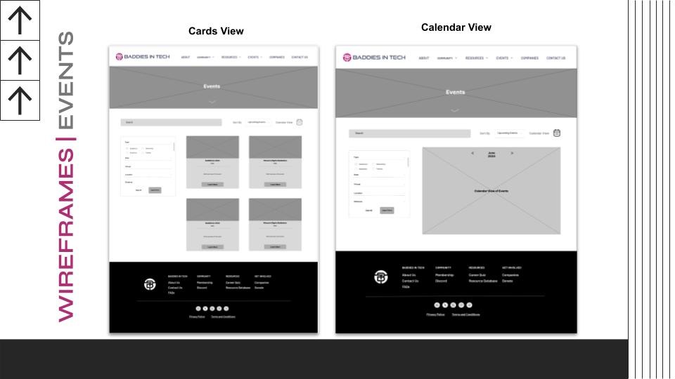
Events Page: The Events page would be needed to have clear organization by using cards which would help organize content into mangeable cunks.
Display Impact Numbers: We would need to display impact numbers on the website to build trust and engage visitors.
Testimonials: Like many of the sites we've studied, there needs to be a testimonial section for the theme of building trust and heliping to increase conversion rates.
FAQ: Lastly, a collapsible FAQ would improve User Experience and echance readability of the website.
Competitive Analysis Takeaways
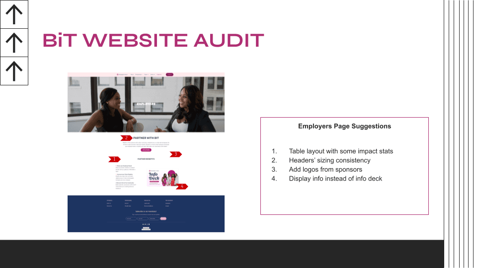
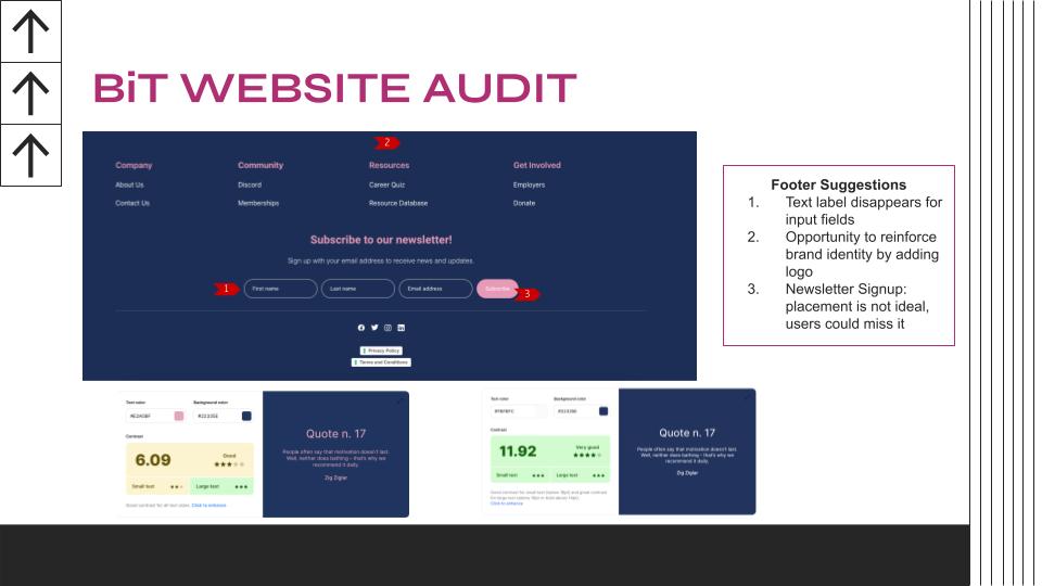
Current Website Audit
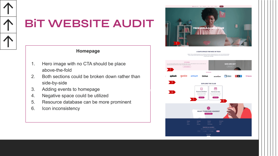
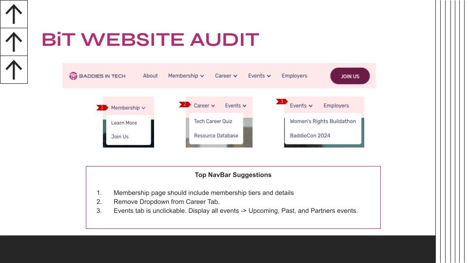
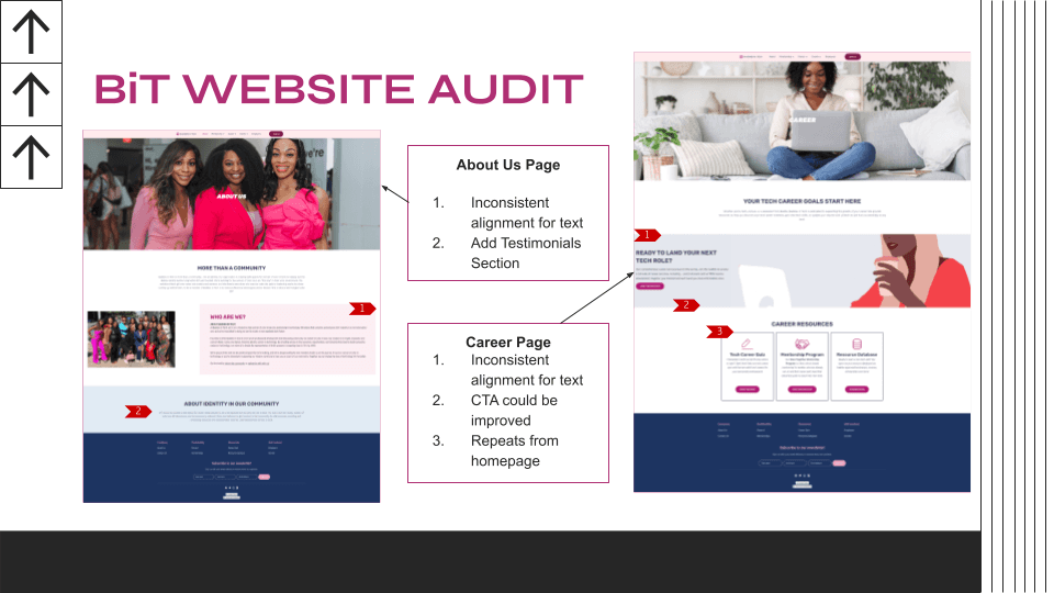
My team also conducted a website audit in order to dissect the current design of the website and see what ways we can improve it. Below are some of the audits we have done, however the full audit can be seen here.
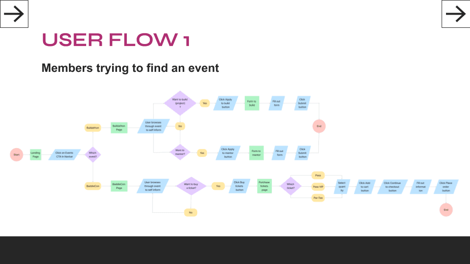
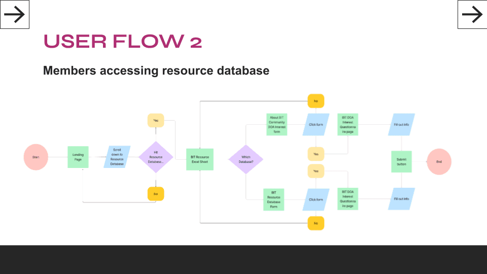
User Flows
After many workshops and analysis of the website, we were set to create user flows. The main flows we wanted to focus on is how users would navigate getting resources from the database and how members would be able to find the upcoming events hosted by Baddies in Tech.

Information Architecture
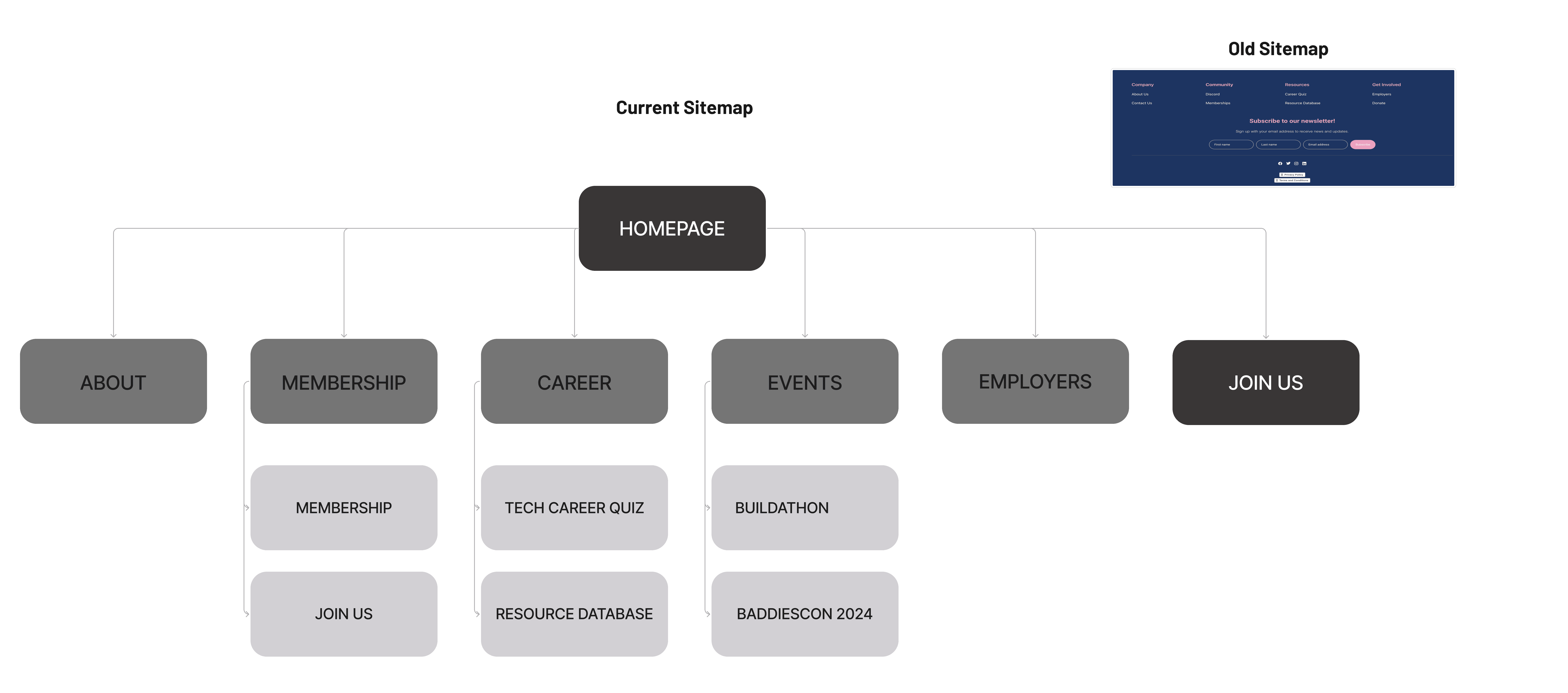
From the website audit, we have determined that one feature that was not in Baddies in Tech's favor was their current sitemap. The website's sitemap offered little to no information about what the organization has to offer in terms of programs, events, and resources. Not only was the lack of information prevalent, but there were dropdowns that were unnecessary and confused users even more on what to click.
To achieve a more intuitive and user-friendly navigation we sought out to find ways to mitigate the uses of dropdowns and allow for each section of the navigation bar to speak for themselves. We also included elements that would be informative for members, employers, and partners with each of the pages.
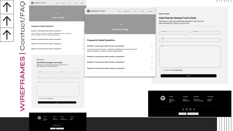
Mid-Fidelity Wireframes
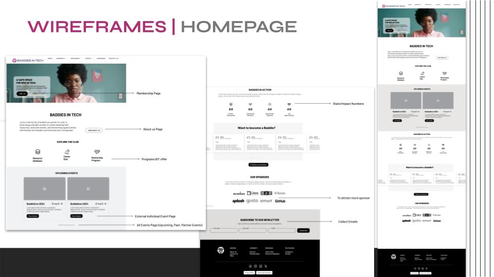
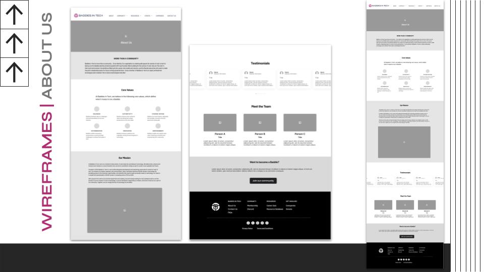
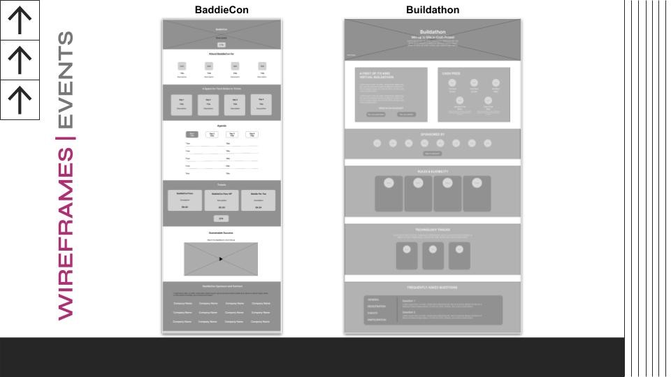
After creating a brand-new sitemap for the website, we went on to create mid-fidelity wireframes. Our goal was to redesign each page with a clean look that pact a ton of useful information about the organization, it's story, mission, core values, events, programs, and resources. Below are the frames we have done for each page.
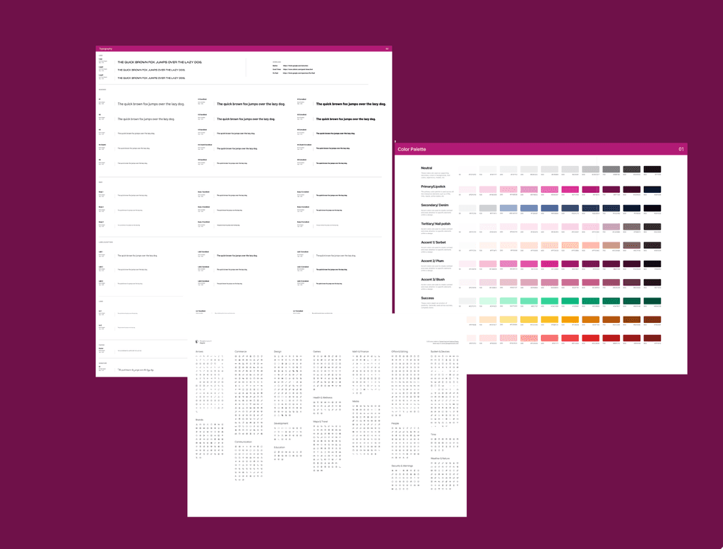
Design System
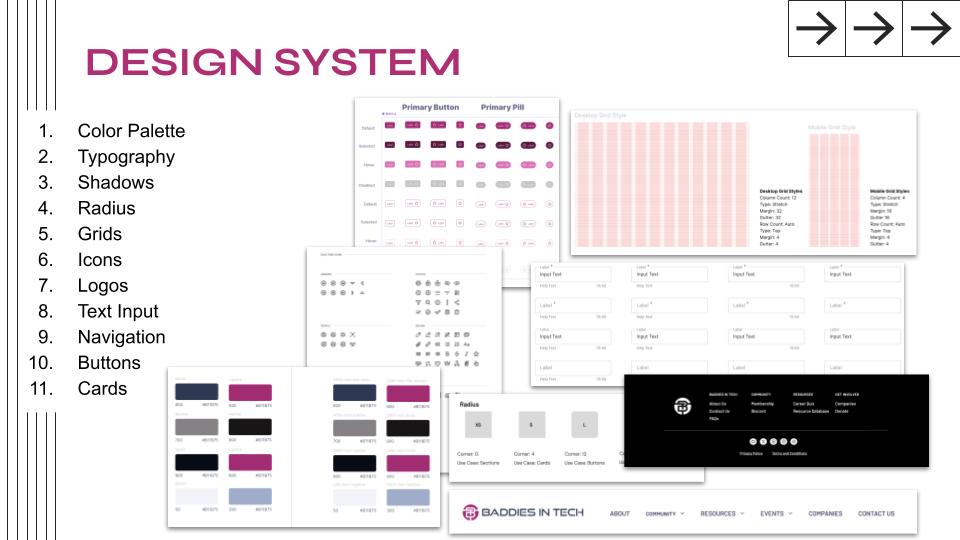
An important aspect between each of the teams involved with this project and the client was the brand identity. Baddie in Tech is known for their rich and fashionable color scheme and appearance as a nod to term "Baddies" and the powerful female presence throughout Baddies in Tech.
In the new design system, we wanted that keep true to their identity by featuring typography, color shades, icons, and buttons that reflected the organization's values and commitment to seeking a safer space for women in tech.
The full Design system can be seen here.
High-Fidelity Wireframes
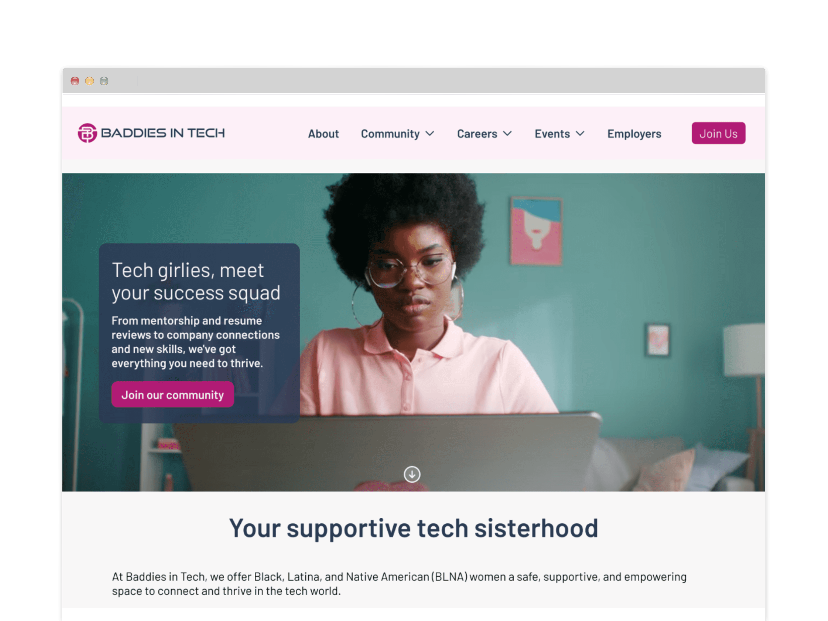
After completing mid fidelity wireframes and creating a design system that reflects Baddies in Tech's brand, it was time for us to create our high-fidelity wireframes. Below are the high fidelities we have created for the new website.
Click the full High-fidelity wireframes in its entirety.
User Testing and Iterations
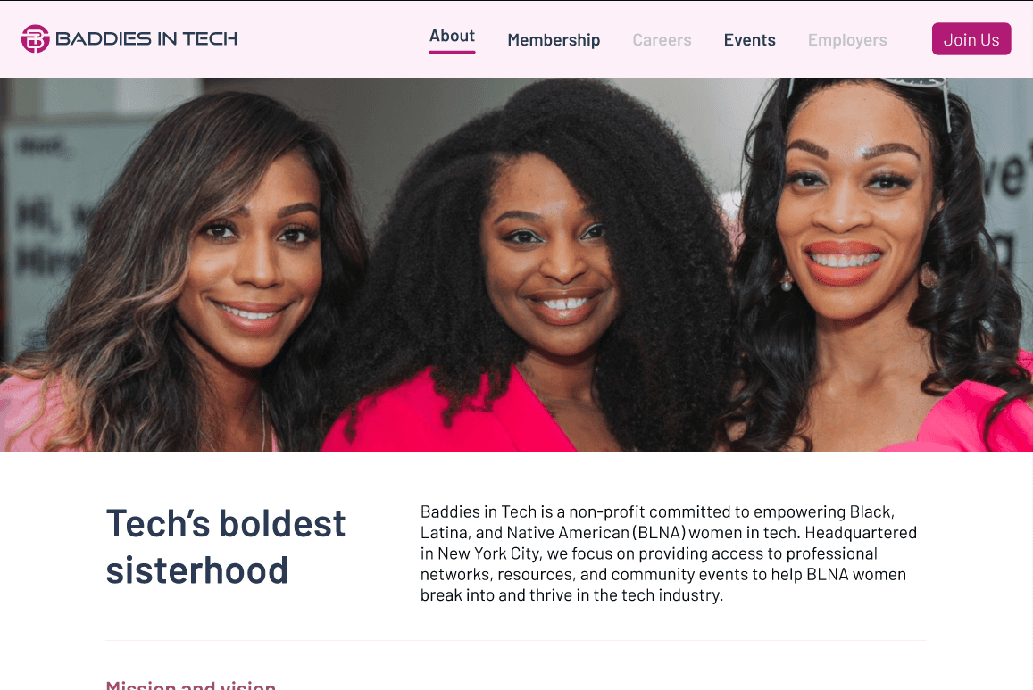
Once our high-fidelity wireframes were done, we sent it over to our research team for A/B testing. The UX research team conducted tests on the new website design prototype and how it would fair out amongst the five ideal participants for this project. It was decided that there should be highlights on the navigation to indicate what section the user was on, as well as inconsistencies with the colors for the buttons.
To the right shows the improve navigation bar. We solved the problem of highlighting the page the user was on by underlining the section on the navigation bar and giving it height to distinguish the difference between the active pages and the rest.
Next Steps and Takeaways
The next steps were to get ready for hand off so the development team could implement our designs onto a live website. To get ready for that, we held meetings with the development team to discuss our designs, layout, and design system.
This experience has been a pleasure. I gained firsthand experience of what it was like working in an agile environment with cross collaboration through different teams. I am so happy to have worked in collaboration with a company who share the same values of creating a safe space for woc in an industry like tech. Though this was only Phase 1, I would love to continue to be involved in making more pages for Baddies in Tech for future projects of theirs.
